One of the three new controls included in the February 2010 release of the WPF toolkit is the Accordion control. This control is similar to a collection of standard Expander controls with the behavior that only one item is expanded at a time. Diederik Krols wrote an excellent tutorial in a posting entitled How to play the Accordion. The Accordion is an excellent alternative to multiple tabs on a TabControl.
The purpose of this posting is to describe a workaround for instances when the contents of an AccordionItem is larger than the space provided. For example, if the sample app used in the posting was reduced in height then you would see the following. That is, no scrollbars.
To add scrollbars so that the contents of each AccordionItem is scrollable we need to change the default alignment properties and add ScrollViewers as below.
<Window x:Class="WpfApplication10.MainWindow"
xmlns="http://schemas.microsoft.com/winfx/2006/xaml/presentation"
xmlns:x="http://schemas.microsoft.com/winfx/2006/xaml"
xmlns:layoutToolkit="clr-namespace:System.Windows.Controls;
assembly=System.Windows.Controls.Layout.Toolkit"
Title="MainWindow"
Height="300"
Width="400">
<Window.Resources>
<Style TargetType="layoutToolkit:AccordionItem">
<Setter Property="HorizontalContentAlignment" Value="Stretch"/>
<Setter Property="VerticalContentAlignment" Value="Stretch"/>
</Style>
<Style TargetType="Button">
<Setter Property="HorizontalAlignment" Value="Left"/>
</Style>
</Window.Resources>
<Grid>
<layoutToolkit:Accordion VerticalAlignment="Stretch" Width="200">
<layoutToolkit:AccordionItem Header="Mail">
<ScrollViewer VerticalScrollBarVisibility="Auto">
<StackPanel Orientation="Vertical" HorizontalAlignment="Stretch">
<Button Content="Button 1" Width="75" />
<Button Content="Button 2" Width="75" />
<Button Content="Button 3" Width="75" />
<Button Content="Button 4" Width="75" />
<Button Content="Button 5" Width="75" />
<Button Content="Button 6" Width="75" />
<Button Content="Button 7" Width="75" />
</StackPanel>
</ScrollViewer>
</layoutToolkit:AccordionItem>
<layoutToolkit:AccordionItem Header="Calendar">
<ScrollViewer VerticalScrollBarVisibility="Auto">
<StackPanel Orientation="Vertical" HorizontalAlignment="Stretch">
<Button Content="Button 1" Width="75" />
<Button Content="Button 2" Width="75" />
<Button Content="Button 3" Width="75" />
<Button Content="Button 4" Width="75" />
<Button Content="Button 5" Width="75" />
<Button Content="Button 6" Width="75" />
<Button Content="Button 7" Width="75" />
</StackPanel>
</ScrollViewer>
</layoutToolkit:AccordionItem>
<layoutToolkit:AccordionItem Header="Contacts">
<ScrollViewer VerticalScrollBarVisibility="Auto">
<StackPanel Orientation="Vertical" HorizontalAlignment="Stretch">
<Button Content="Button 1" Width="75" />
<Button Content="Button 2" Width="75" />
<Button Content="Button 3" Width="75" />
<Button Content="Button 4" Width="75" />
<Button Content="Button 5" Width="75" />
<Button Content="Button 6" Width="75" />
<Button Content="Button 7" Width="75" />
</StackPanel>
</ScrollViewer>
</layoutToolkit:AccordionItem>
<layoutToolkit:AccordionItem Header="Tasks">
<ScrollViewer VerticalScrollBarVisibility="Auto">
<StackPanel Orientation="Vertical" HorizontalAlignment="Stretch">
<Button Content="Button 1" Width="75" />
<Button Content="Button 2" Width="75" />
<Button Content="Button 3" Width="75" />
<Button Content="Button 4" Width="75" />
<Button Content="Button 5" Width="75" />
<Button Content="Button 6" Width="75" />
<Button Content="Button 7" Width="75" />
</StackPanel>
</ScrollViewer>
</layoutToolkit:AccordionItem>
</layoutToolkit:Accordion>
</Grid>
</Window>
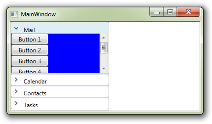
Now, the contents portion of the AccordionItem displays a scrollbar whenever needed as shown below.
The blue background is an unfortunately bug in the WPF Toolkit as discussed here.


