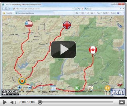
Almost a year ago, ESRI’s Applications Prototype Lab published a video demonstrating a cross country mobility (or CCM) application for Microsoft’s Surface device. This application is now available as a public Silverlight-based web application. Click here to launch the web application or you can watch the embedded video above.
How to run the demonstration:
- Open a web browser to:
http://maps.esri.com/sldemos/ccm/default.html
(you may be prompted to install Silverlight 4) - Move the target icon anywhere on the map. This is the destination of the three flagged icons.
- Move the three flagged icons to any location on the map. These icons represent three vehicles that are seeking the most efficient route to the target icon.
- Click the Weighting button to adjust the parameters for the cost surface. In this menu you can refine the definition of “cost” for each pixel on the map. Moving a slider to the left indicates that the category or sub-category is less expensive (in time, money, fuel or some other resource). Similarly, moving a slider to the right indicates that category or sub-category is more expensive or costly.
- Click the Submit button to send the weighting parameters to the server. The server will create and return a cost surface shaded from green to red. A green area represents areas that are cheap to traverse whereas red areas are more expensive. Unshaded areas are “no-go” areas that cannot be traversed whatsoever such as water bodies (as defined in the weighting menu above).
- Click the Show/Hide Surface button to hide the cost surface (optional),
- Click the Path button to display best path, that is,the path of least cost (in fuel, time, money etc).
- Move the flagged icons and click the Path button to repeat the best path analysis. You cannot change the position of the target icon at this stage because the cost surface has been optimized with respect to the destination. To change the destination click the Reset button to start over.
- Before moving to the next step move the vertical slider on the right hand slide so that the map only displays satellite imagery. This will make the results of the next step a little easier to visualize.
- Click the Corridor button. Rather than showing just the ideal routing solution, the server will now calculate the top three percentile solution set. The result is a multi-shaded corridor with the lightest shade represent the top three percentile and the darker shade the top one percentile. This type of analysis is useful in highlighting choke points, that is, locations where people and vehicle must pass through. Conversely it is a useful tool to locate possible ambush location.

No comments:
Post a Comment