Friday, April 27, 2012

Pivot for ArcGIS Online

Snap3

Late last year Microsoft released the fifth and possibly final version of Silverlight. The most highly publicized improvement was the addition of 3d graphics support. A lesser known improvement was the inclusion of an updated PivotViewer control.

The first edition of the PivotViewer was used in a 2010 prototype entitled mosaic image finder, this app allowed users to display and filter a large collection of satellite imagery. Whilst it may have been technically possible to support dynamic collections, for simplicity, this and most other implementations used static collections.

The second and most recent edition of the PivotViewer is significantly improved. Developers can now bind viewers to dynamic collections and have the ability to style individual items (or tradecards).

The Applications Prototype Lab used the new edition of PivotViewer and the ArcGIS Portal API to render search results from ArcGIS Online. Searching ArcGIS Online for content related to “usa” reveals approximately 3,000 results. Unfortunately these search results can only be browsed ten at a time on www.arcgis.com. With the PivotViewer, all 3,488 map items can be viewed simultaneously or interrogated individually.

To use the live application, click here.

To download the source code, click here.

To watch a video, click here.

Tuesday, March 6, 2012

Fixing the WPF Accordion

image

One of the three new controls included in the February 2010 release of the WPF toolkit is the Accordion control. This control is similar to a collection of standard Expander controls with the behavior that only one item is expanded at a time. Diederik Krols wrote an excellent tutorial in a posting entitled How to play the Accordion. The Accordion is an excellent alternative to multiple tabs on a TabControl.

The purpose of this posting is to describe a workaround for instances when the contents of an AccordionItem is larger than the space provided. For example, if the sample app used in the posting was reduced in height then you would see the following. That is, no scrollbars.

image

To add scrollbars so that the contents of each AccordionItem is scrollable we need to change the default alignment properties and add ScrollViewers as below.

<Window x:Class="WpfApplication10.MainWindow"

        xmlns="http://schemas.microsoft.com/winfx/2006/xaml/presentation"

        xmlns:x="http://schemas.microsoft.com/winfx/2006/xaml"

        xmlns:layoutToolkit="clr-namespace:System.Windows.Controls;

                             assembly=System.Windows.Controls.Layout.Toolkit"

        Title="MainWindow"

        Height="300"

        Width="400">

    <Window.Resources>

        <Style TargetType="layoutToolkit:AccordionItem">

            <Setter Property="HorizontalContentAlignment" Value="Stretch"/>

            <Setter Property="VerticalContentAlignment" Value="Stretch"/>

        </Style>

        <Style TargetType="Button">

            <Setter Property="HorizontalAlignment" Value="Left"/>

        </Style>

    </Window.Resources>

    <Grid>

        <layoutToolkit:Accordion VerticalAlignment="Stretch"  Width="200">

            <layoutToolkit:AccordionItem Header="Mail">

                <ScrollViewer VerticalScrollBarVisibility="Auto">

                    <StackPanel Orientation="Vertical" HorizontalAlignment="Stretch">

                        <Button Content="Button 1" Width="75" />

                        <Button Content="Button 2" Width="75" />

                        <Button Content="Button 3" Width="75" />

                        <Button Content="Button 4" Width="75" />

                        <Button Content="Button 5" Width="75" />

                        <Button Content="Button 6" Width="75" />

                        <Button Content="Button 7" Width="75" />

                    </StackPanel>

                </ScrollViewer>

            </layoutToolkit:AccordionItem>

            <layoutToolkit:AccordionItem Header="Calendar">

                <ScrollViewer VerticalScrollBarVisibility="Auto">

                    <StackPanel Orientation="Vertical" HorizontalAlignment="Stretch">

                        <Button Content="Button 1" Width="75" />

                        <Button Content="Button 2" Width="75" />

                        <Button Content="Button 3" Width="75" />

                        <Button Content="Button 4" Width="75" />

                        <Button Content="Button 5" Width="75" />

                        <Button Content="Button 6" Width="75" />

                        <Button Content="Button 7" Width="75" />

                    </StackPanel>

                </ScrollViewer>

            </layoutToolkit:AccordionItem>

            <layoutToolkit:AccordionItem Header="Contacts">

                <ScrollViewer VerticalScrollBarVisibility="Auto">

                    <StackPanel Orientation="Vertical" HorizontalAlignment="Stretch">

                        <Button Content="Button 1" Width="75" />

                        <Button Content="Button 2" Width="75" />

                        <Button Content="Button 3" Width="75" />

                        <Button Content="Button 4" Width="75" />

                        <Button Content="Button 5" Width="75" />

                        <Button Content="Button 6" Width="75" />

                        <Button Content="Button 7" Width="75" />

                    </StackPanel>

                </ScrollViewer>

            </layoutToolkit:AccordionItem>

            <layoutToolkit:AccordionItem Header="Tasks">

                <ScrollViewer VerticalScrollBarVisibility="Auto">

                    <StackPanel Orientation="Vertical" HorizontalAlignment="Stretch">

                        <Button Content="Button 1" Width="75" />

                        <Button Content="Button 2" Width="75" />

                        <Button Content="Button 3" Width="75" />

                        <Button Content="Button 4" Width="75" />

                        <Button Content="Button 5" Width="75" />

                        <Button Content="Button 6" Width="75" />

                        <Button Content="Button 7" Width="75" />

                    </StackPanel>

                </ScrollViewer>

            </layoutToolkit:AccordionItem>

        </layoutToolkit:Accordion>

    </Grid>

</Window>


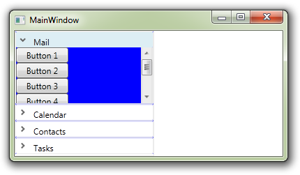
 Now, the contents portion of the AccordionItem displays a scrollbar whenever needed as shown below.
image

The blue background is an unfortunately bug in the WPF Toolkit as discussed here.

Friday, March 2, 2012

Augmented Reality and GIS

Over the past few years we have seen two important trends, the consumerization of GIS technology and the proliferation of affordable smart phones. These trends converge to provide geographically-enabled applications for mobile devices in the consumer market. Consumers can get shopping, weather or routing information with respect to their current location and more importantly share that information with other devices.

Application developers have access to device peripherals like a digital compass, accelerometer, assisted GPS and camera. Developers can use these peripherals to transform a mobile phone into a spatially enabled (or “geographically-aware”) sensor. Whether photographing oil spill damage or recording your mountain bike trail, the smart phone is essentially a real-time GIS data capture device.

Augmented reality (AR) is just one technique that can leveraged by GIS developers on mobile devices. AR involves the overlaying of graphics on real-time georeferenced video feeds. App developers like LAYAR use AR to reveal the locations of nearby restaurants and hotels but AR can and should do a lot more. Smart phones could be used to view subterranean infrastructure such as electrical transmission lines or water reticulation pipes. AR could be used by firemen to visualize the three dimensional route in and around buildings. The applications are endless.

To conclude, the practical usefulness of AR can only be achieved with the application of real-time spatial analysis. What if there was as AR app that could highlight diseased grass or display routes to family members in a crowded stadiums? GIS can “add value” to augmented reality.

Friday, December 16, 2011

How to customize Esri’s Silverlight TimeSlider

image

The Esri ArcGIS SIlverlight Toolkit SDK is a companion of Esri’s ArcGIS API for Silverlight. The toolkit includes a number of useful controls including a magnifier, scale bar and an info window to display map popup windows. This post will demonstrate how to customize (or style) the toolkit’s TimeSlider control.

To view a live application click here.
To download the full source code click here.

By default, the toolkit’s TimeSlider looks like this:

image

With a style applied it is possible to transform the TimeSlider to look like this:

image

To achieve this appearance you but include the follow two styles as a resource. The first style is for the Thumb.

<Style x:Key="SleekThumb" TargetType="Thumb">
    <Setter Property="Foreground" Value="Black"/>
    <Setter Property="BorderBrush" Value="Transparent"/>
    <Setter Property="BorderThickness" Value="0"/>
    <Setter Property="IsTabStop" Value="False"/>
    <Setter Property="Height" Value="12"/>
    <Setter Property="Width" Value="12"/>
    <Setter Property="Cursor" Value="Hand"/>
    <Setter Property="Template">
        <Setter.Value>
            <ControlTemplate TargetType="Thumb">
                <Grid>
                    <VisualStateManager.VisualStateGroups>
                        <VisualStateGroup x:Name="CommonStates">
                            <VisualState x:Name="Normal"/>
                            <VisualState x:Name="MouseOver"/>
                            <VisualState x:Name="Pressed" />
                            <VisualState x:Name="Disabled" />
                        </VisualStateGroup>
                        <VisualStateGroup x:Name="FocusStates">
                            <VisualState x:Name="Focused"/>
                            <VisualState x:Name="Unfocused"/>
                        </VisualStateGroup>
                    </VisualStateManager.VisualStateGroups>
                    <Ellipse Fill="{TemplateBinding Background}"
Height="{TemplateBinding Height}"
Width="{TemplateBinding Width}"
Stroke="{TemplateBinding BorderBrush}"
StrokeThickness="{TemplateBinding BorderThickness}"/>
                </Grid>
            </ControlTemplate>
        </Setter.Value>
    </Setter
>
</
Style
>

And then the TimeSlider itself.

<Style x:Key="SleekTimeSlider" TargetType="esri:TimeSlider">
    <Setter Property="IsTabStop" Value="False" />
    <Setter Property="Foreground" Value="Black"/>
    <Setter Property="Template">
        <Setter.Value>
            <ControlTemplate TargetType="esri:TimeSlider">
                <Grid>
                    <!--VisualState wiring - not used-->
                    <VisualStateManager.VisualStateGroups>
                        <VisualStateGroup x:Name="CommonStates">
                            <VisualState x:Name="Normal"/>
                            <VisualState x:Name="MouseOver"/>
                            <VisualState x:Name="Disabled"/>
                        </VisualStateGroup>
                        <VisualStateGroup x:Name="FocusStates">
                            <VisualState x:Name="Focused" />
                            <VisualState x:Name="Unfocused"/>
                        </VisualStateGroup>
                    </VisualStateManager.VisualStateGroups>

                    <!-- Slider core -->
                    <Grid x:Name="HorizontalTrack">
                        <!--Hide tick marks (but still used for snapping)-->
                        <esriToolkitPrimitives:TickBar x:Name="TickMarks"
Margin="0,0,0,0"
IsHitTestVisible="False">
                            <esriToolkitPrimitives:TickBar.TickMarkTemplate>
                                <DataTemplate>
                                    <Grid />
                                </DataTemplate>
                            </esriToolkitPrimitives:TickBar.TickMarkTemplate>
                        </esriToolkitPrimitives:TickBar>

                        <!--Background Track-->
                        <Rectangle Height="3" Margin="5,0"
StrokeThickness="{TemplateBinding BorderThickness}"
Fill="LightGray"/>

                        <!--Left repeater button-->
                        <RepeatButton
                           x:Name="HorizontalTrackLargeChangeDecreaseRepeatButton"
                                                           
                          
IsTabStop="False"
                                 
                          
HorizontalAlignment="Stretch"
                           Opacity="0" />

                        <!--Minimum thumb-->
                        <Thumb
                           x:Name="MinimumThumb"
                          
                          
DataContext="{TemplateBinding Value}"
                           ToolTipService.ToolTip="{Binding Start}"
 
                          
ToolTipService.Placement="Top"
                           HorizontalAlignment="Left"
                           Foreground="{TemplateBinding Foreground}"
                           Style="{StaticResource SleekThumb}" />

                        <!--Middle thumb-->
                        <Thumb
                           x:Name="HorizontalTrackThumb"
                                                                                                                         
                          
IsTabStop="False"
                           Cursor="Hand"
                           HorizontalAlignment="Left"
              
                          
Foreground="{TemplateBinding Foreground}">
                            <Thumb.Template>
                                <ControlTemplate>
                                    <Rectangle Height="3"
Fill="{TemplateBinding Foreground}" />
                                </ControlTemplate>
                            </Thumb.Template>
                        </Thumb>

                        <!--Maximum thumb-->
                        <Thumb
                           x:Name="MaximumThumb"
                                   
                          
DataContext="{TemplateBinding Value}"
ToolTipService.ToolTip="{Binding End}"
 
                          
ToolTipService.Placement="Top"
                           HorizontalAlignment="Left"
                           Foreground="{TemplateBinding Foreground}"
                           Style="{StaticResource SleekThumb}" />

                        <!--Right repeater button-->
                        <RepeatButton
                           x:Name="HorizontalTrackLargeChangeIncreaseRepeatButton"
   
                          
IsTabStop="False"
                                   
                          
HorizontalAlignment="Stretch"
                           Opacity="0" />
                    </Grid>
                </Grid>
            </ControlTemplate>
        </Setter.Value>
    </Setter
>
</
Style
>

The XAML page containing two styles above must have the following namespaces defined.

xmlns:esri="http://schemas.esri.com/arcgis/client/2009"
xmlns:esriToolkitPrimitives=
"clr-namespace:ESRI.ArcGIS.Client.Toolkit.Primitives;
assembly=ESRI.ArcGIS.Client.Toolkit"

Finally, apply the style to the TimeSlider as shown below.

<esri:TimeSlider
   Grid.Row="1"
   x:Name="TimeSlider"
   TimeMode="TimeExtent"
   Foreground="Black"

    Style="{StaticResource SleekTimeSlider}"
/>

In closing, the controls included in the ArcGIS Silverlight Toolkit are no different from other controls with respect to styling and templating. To assist with styling other toolkit controls I would recommend browse the toolkit’s source code on codeplex. Alternatively you can just tweak the XAML in the post to fit your needs.